Meta Portal
The Tension
Meta Portal launched in 2018 as a family calling device. A high-density smart camera that used AI to pan and reframe. A simple, opinionated interface designed for grandparents talking to grandkids. It did one thing well: building connection with your loved ones.
When COVID-19 hit, Portal saw a massive spike in usage. Leadership saw an opportunity and made a strategic bet: bring Portal to the desk of knowledge workers. The hardware team started developing Portal+ as an "on desk" device.
There was one problem. No clear software story. No understanding of what features knowledge workers actually need from a secondary screen on their desk. The hardware was being built, but the experience that would make it worth buying didn't exist yet.
My Role
I was the Product Design Lead for all work-based experiences on Portal. I led a team of 5+ designers and partnered closely with Product, Engineering, and User Research to define the product vision, ship the roadmap, and deliver on time for the Portal+ and Portal Go hardware launch in September 2021. I was one of the launch DRIs, end-to-end responsible for ensuring all blocking features shipped.
Discovery: What Do Workers Actually Need?
Before designing anything, I led a foundational piece of discovery work with our UXR team. The question wasn't "what features should Portal have?" It was "what do knowledge workers actually want from their workday, and which of those needs can a secondary screen uniquely solve?"
We identified the top 11 goals knowledge workers have during their day, then stack-ranked them against Portal's strengths. The number one goal wasn't "more productivity apps" or "better video calls." It was: "Make sure I don't miss important or time-sensitive information."
That insight reshaped everything. It told us Portal's value wasn't in being a second computer. It was in being a calm, glanceable surface that keeps you aware of what's coming next without demanding your attention. We leaned into Portal's existing design philosophy of being a "calm house guest" and applied it to work.
This discovery work became the foundation for the entire Portal for Work strategy, ratified by leadership at the Director and VP levels.
The Solution
I delivered three core features as part of the Portal+ and Portal Go launch:
- A redesigned PortalOS Home Screen with a proactive notification card system
- Portal Calendar with one-tap meeting joins and third-party provider detection
- Screenshare and screen mirroring via a new Portal Companion App
Proactivity
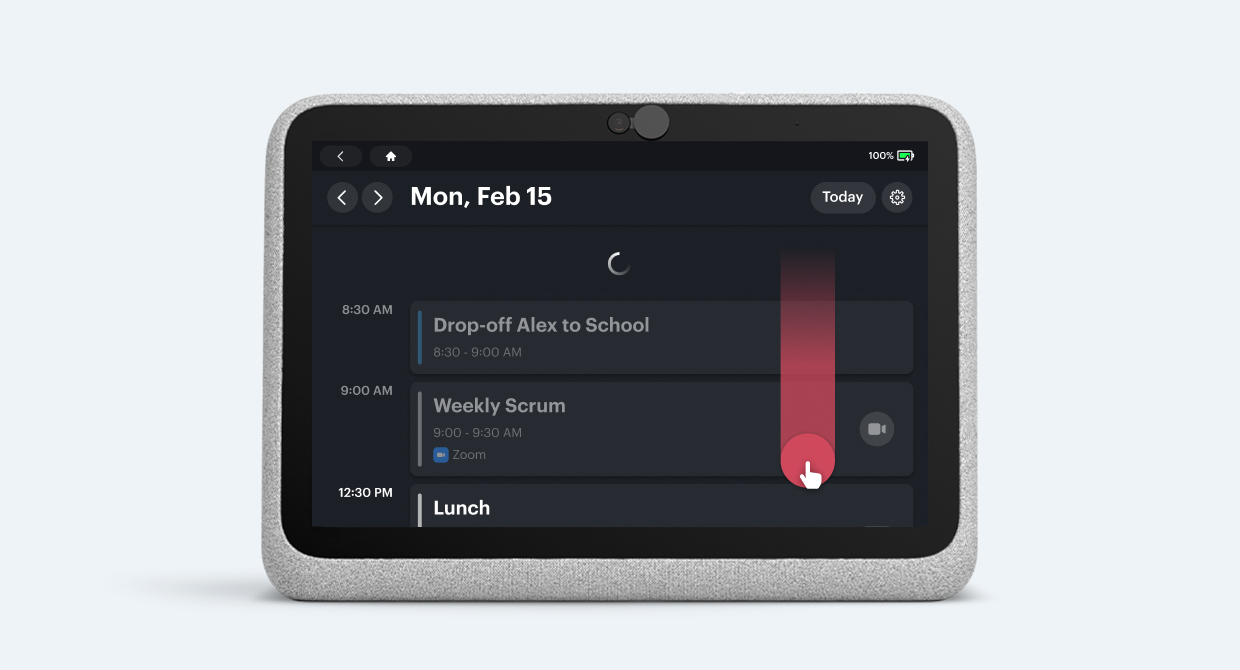
The research told us that focus isn't about turning off notifications. Workers feel more in control when they can glance at what's coming up without context-switching. So instead of building complex apps, we designed a card system that surfaces the right information at the right moment.
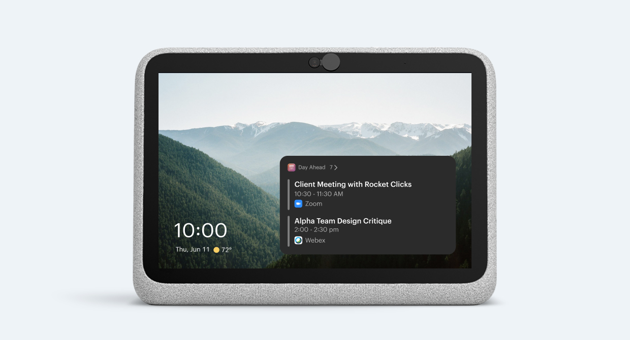
Portal sits quietly on the desk, surfacing upcoming events through cards. No interaction needed. This was a direct response to the top workday goal we identified in research.
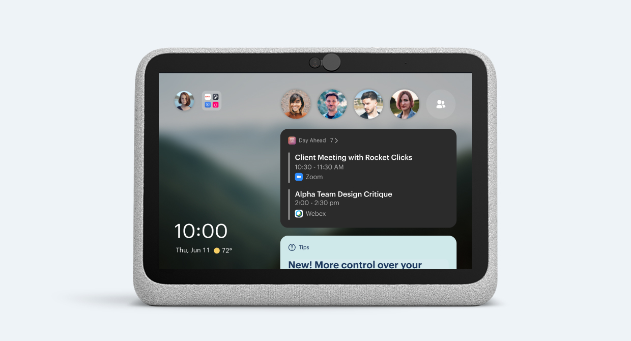
A single tap reveals more: additional calendar cards, quick-access contacts. We deliberately kept the information density low. Four visible events was the sweet spot between glanceability and overwhelm, validated across multiple research sessions.
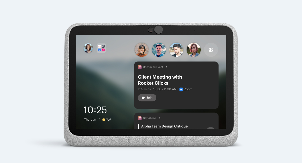
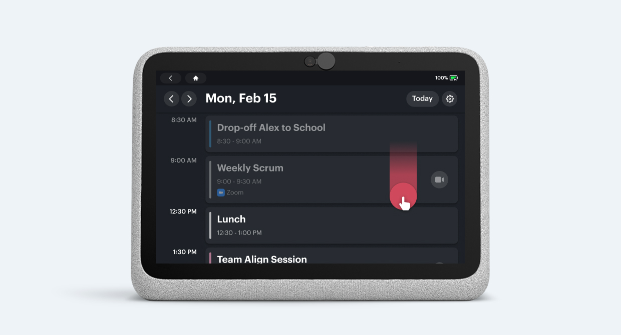
When a meeting is about to start, that card elevates to the top of the feed with a clear join action. One tap. No fumbling through calendar apps or hunting for meeting links.
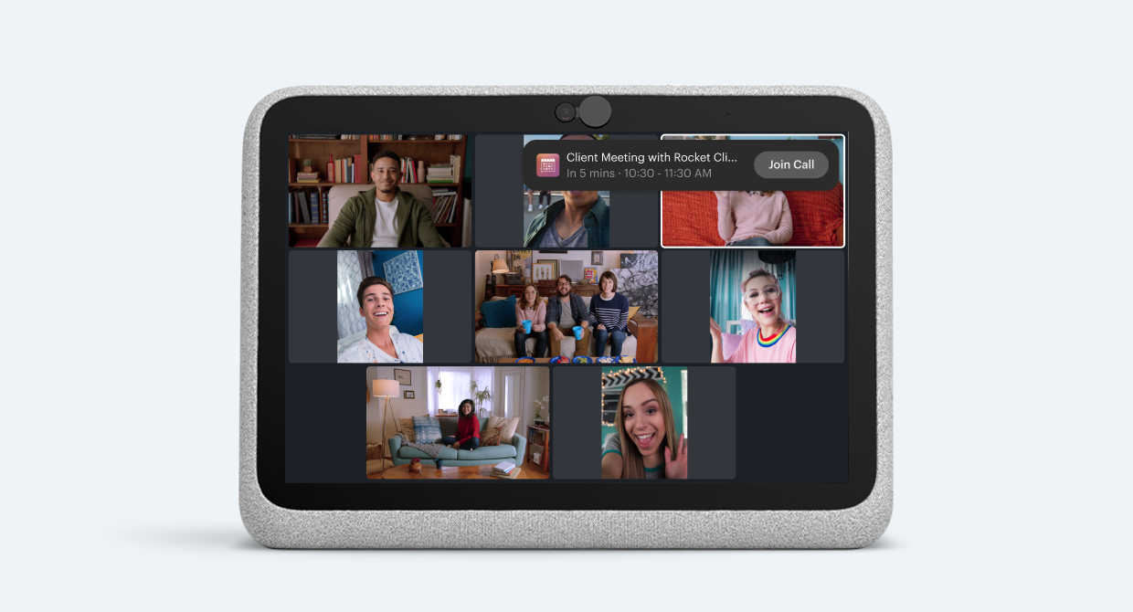
Calendar-aware notifications solve the "binge meeting" problem. Back-to-back calls become manageable when your next meeting is always one tap away.
Simplicity
We made a deliberate choice: Portal would do very few things, but do them exceptionally well. Every experience was designed to be consumed from arm's length with minimal touch interaction. This was a trade-off. It meant saying no to feature requests that would have added complexity in exchange for flexibility. We chose conviction over comprehensiveness.
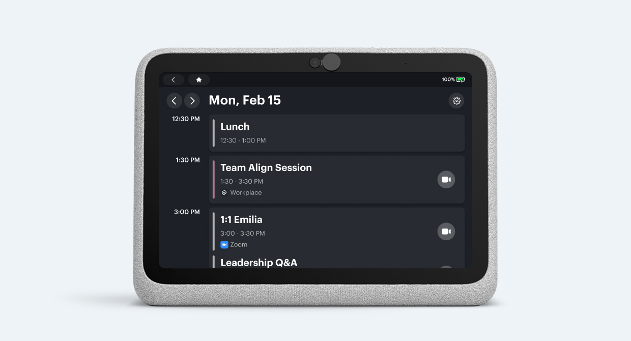
The Calendar agenda is intentionally constrained to four visible events. This wasn't arbitrary. It came directly from research sessions where we tested different densities and found that four was the point where users could process at a glance without feeling they were missing something.
Embedding into Existing Workflows
One of the trickiest parts of the project was third-party integration. Enterprise customers won't adopt a device that forces them to change their video conferencing provider. Portal needed to work with the tools people already use.
I developed a clear user story for third-party partnerships: Portal's Calendar would automatically detect whether a meeting was on Zoom, WebEx, or another provider, and display the correct branding and launch flow. This gave partners a front-row seat on the home screen. The story landed well internally, and it unblocked partner teams who had been struggling to articulate a clear narrative to Zoom and WebEx.
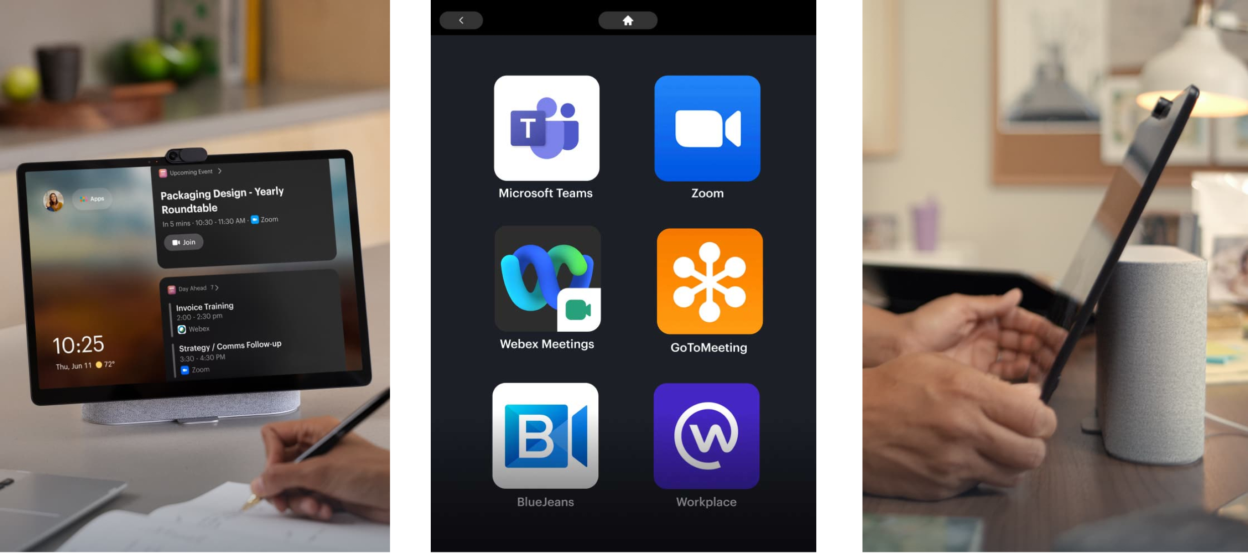
Automatic provider detection meant users never had to think about which app to open. The calendar card handled it. This paved the way for successful partnerships with Zoom and WebEx, with Teams and Google Hangouts in the pipeline.
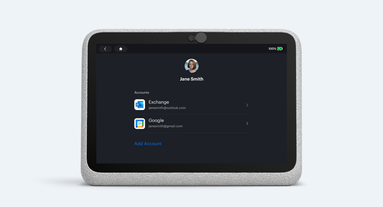
Support for multiple calendar sources, intelligently prioritising between work and personal events.
Evidence
On 21 September 2021, Meta successfully launched Portal Go and Portal+, marking Portal's entry into the work segment.
- Exceeded the team's 30% DAD/MAD target, hitting 32.5% DAD/MAD (Daily Active Devices / Monthly Active Devices) before the holidays.
- The Portal Companion app exceeded its 20% DAD/MAD target, reaching 21.4%.
- Between 2021 and 2022, Meta sold over 950,000 Portal units. 22% of those were directly attributable to users who bought Portal for work-based experiences.
- The third-party partnership story unblocked successful integrations with Zoom and WebEx, with Teams and Google Hangouts in the pipeline.
- I led a team of 5+ designers across multiple pillars, and the work contributed to the promotion of 2 designers to a higher level.
- The discovery research on "Remote Workday Goals" became the linchpin for the Portal for Work strategy, and influenced investment decisions for other Meta work teams including Workplace and Workrooms.
What I Learned
Portal had a quarterly release cycle. Software only shipped to devices every three months. That constraint forced a level of planning discipline I hadn't experienced before. There was zero margin for slipped timelines. I set clear milestones, ran tight feedback loops, and learned that the hardest part of shipping hardware-coupled software isn't the design. It's the coordination.
The other lesson was about conviction. Portal's value was in doing less, not more. Every feature request we declined was a bet that simplicity would win. The DAD/MAD numbers suggest that bet paid off.